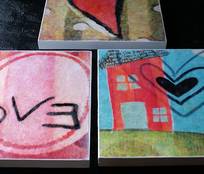
Customizable Monogram Wedding Printable With Tutorial

How to make a monogram

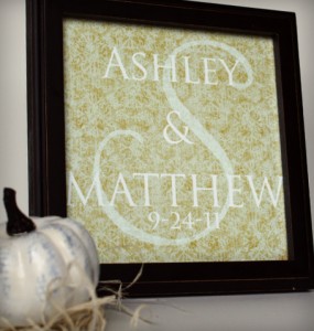
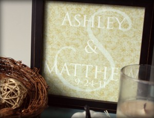
Do you want to skip the registries and opt for a unique, personalized wedding gift that is sure to stand out as a treasured token of the special day?  In this article you will find a free digital download of the layered photoshop file used to make the framed monogram you see here, as well as a simple, detailed photo tutorial showing you how to personalize the text for your bride and groom.

You will need:

  • Photoshop and a basic understanding of how it works.
  • A color printer and glossy photo paper, or a printing service
  • Square picture frame

DIY Wedding Monogram

Tutorial:

  • Download the file I created in photoshop, here.  Unzip and open the file in photoshop.
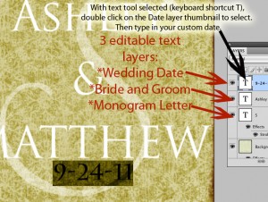
  • Select the text tool in photoshop either by clicking the T in the vertical toolbar on the right, or by hitting ‘t’ on your keyboard.  The text of the image is separated into 3 layers as shown in the picture below.  Double  click the top text layer thumbnail to select the date text, then type in your desired text.  Repeat for the remaining 2 text layers.

Photoshop Monogram Tutorial

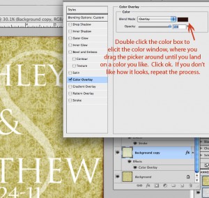
  • Now you have changed the date, the couple’s names and the large surname initial layer in the background.    You can further customize to your liking by changing the color of the overlay effect under layer “Background Copy” as shown below.

Photoshop Text Tutorial

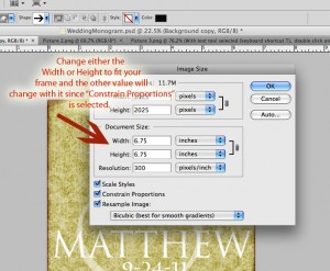
  • Now you will need to size the image to fit your frame.  The original size is 6.75 x 6.75 inches at 300ppi resolution (optimal resolution for highest picture quality).  To do this, click on “Image”, then “Image Size” in the photoshop horizontal toolbar.  Change the size to fit your frame in the window as shown below.  Photoshop text tutorial
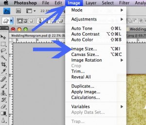
Photoshop text tutorial

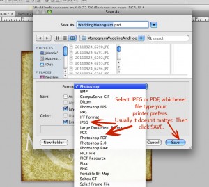
  • Now you are ready to save the file; In toolbar, go to “File” then “Save As”.  You will get the following window.  Save as jpg or pdf as shown.

Photoshop text tutorial

Print at home or use your favorite printing service.  I absolutely love how this turned out, and it took no time at all.


Painted Pillow With Monogram Print Canvas

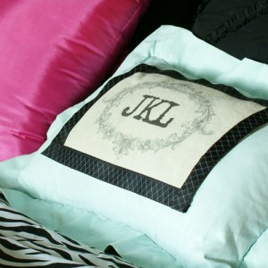
DIY Monogram Pillow
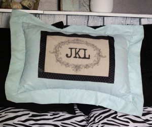
Wow, I “made” a pillow.  You may have noticed, there aren’t sewing projects here at SBLC.  I don’t do that.  I think about doing it occasionally, but it doesn’t happen.  Here is a project, sans sewing, that includes printing on canvas drop cloth material, painting a pillow with fabric paint, and attaching fabric to fabric using liquid stitch.  Easily and quickly make yourself a beautiful, custom, decorative pillow!

Graphics Fairy Pillow DIY


Supplies:

  • Old Pillow (Mine is a Goodwill score)
  • Martha Stewart Decorative Paint by Plaid and Fabric Medium
  • Drop Cloth Canvas cut to 8.5×11
  • Graphic image (I used frame image from Graphics Fairy, and put the letters in with Photoshop)
  • Inkjet Printer
  • Spray Adhesive
  • Paintbrush
  • Ribbon
  • Stitch Witchery
  • Liquid Stitch or other fabric glue

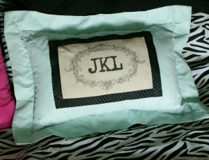
Monogram Painted Pillow

Instructions:

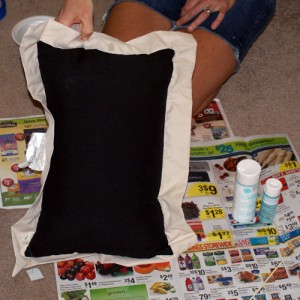
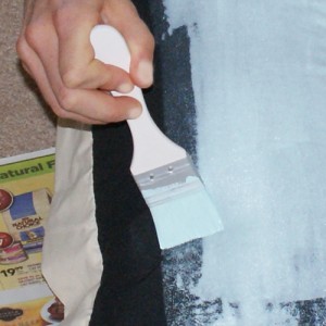
  • Mix paint with fabric medium as directed and paint your pillow!  It felt kinda cool to be painting a pillow.  I got some strange glances from family members wandering by,  but who has a an awesome pillow now?

Martha Stewart Fabric Paint

TIP:  The instructions for the fabric paint medium said to let dry for 24 hours.  I needed to add another coat over the black area of the pillow, so I dried the pillow immediately after the first coat with my heat tool.  Then I added the second coat and let dry overnight.

  • While your pillow is drying, you can prepare your image on your canvas piece.  Go on over to Graphics Fairy, and get yourself a lovely free image (I used this image).  Cut it to fit your printer, and using spray adhesive, adhere the canvas piece to a piece of photo printer paper or to cardstock.  A regular old thin piece of printer paper isn’t sturdy enough.  Insert the piece into your inkjet printer, fabric side down, and print your image.
  • Cut your image to the desired size, fuze ribbon to frame it with Stitch Witchery, then glue the piece onto your dried pillow using Liquid Stitch.  Let dry overnight.  You are done!

No Sew Monogram Pillow DIY

What do you think.  I love it.  The pillow is a little “crunchy” from the paint, but let’s face it, it isn’t meant to be functional.  Not bad for a new sew project!

Awesome Subway Art DIY


Photoshop Beginner Tutorials

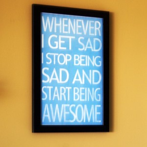
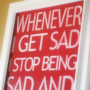
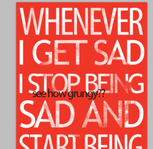
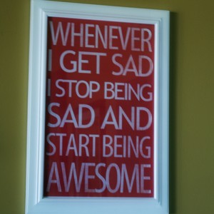
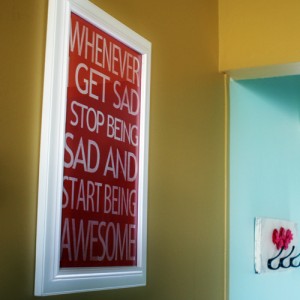
Don’t you just love the subway are that is so big in the blog decor world these days?  I ran into an example on a Pinterest board  that inspired me to create my own.  Here is the original.  This quote is a line from “How I Met Your Mother” – Neil Patrick Harris’s character coined it.  I cracked up when I heard it and loved the idea of it hanging in my stepdaughter’s college dorm room.  It is created in Photoshop, which is wonderful, because you can easily change colors and fonts to suite your needs.  Follow along step by step as I guide your through the CS4 Photoshop process, a rare event here at SBLC!

UPDATE:  Get free printables of all 3 colors at Printable Decor.

Subway art tutorial

Instructions:

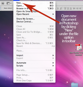
  • In the Photoshop toolbar, click  “New” to open a new document

Photoshop Subway art tutorial

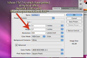
  • Set your document size.  I chose 11×17.  Set your resolution to 300 ppi…

Photoshop Tutorials

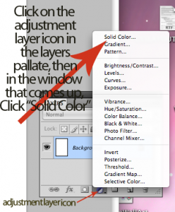
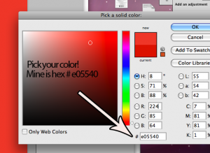
  • Select your background color by clicking the adjustment layer icon in the layers palatte (labeled below), and choosing “solid color”.  A color picker window will appear, where you can pic your color.  Click on your desired color, or enter the hex code.  This will leave you with a color fill layer that you can easily change  (see second pic below).

Photoshop Subway art tutorial

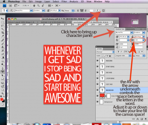
  • Grab the text tool (shortcut is “T” on the keyboard) and select your font.  You want it to be a blocky font if your are going for the subway art feel.  I used 2 fonts here; Myriad Pro Condensed and Trebuchet MS Regular.  You want to keep each line of text a different layer, so that you can adjust each line individually without affecting the font settings on the other lines.  To make your words fit, adjust the font size, as well as the space between the letters.  This requires opening the character panel (pictured below) and changing the AV setting.  A smaller number means the letters are closer together…

Photoshop Subway art tutorial

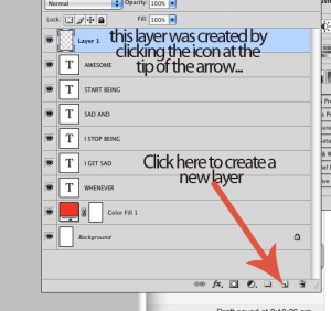
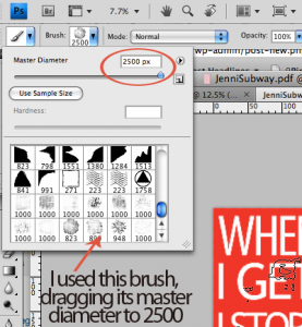
  • When you are happy with the letters, grab a grunge paintbrush (keyboard shortcut B, then choose your desired brush)  and in a new layer, paint over the letters in the same color as the background.  I downloaded this awesome high res grunge brush set for free, here.  BIG thank you to digitalrevolution.  This gives a nice distressed look to the piece.

Photoshop Subway art tutorial

Beginner Photoshop Tutorials

Photoshop Tutorials

Remember the adjustable color layer I had you make for your background?  Perfect for if you have 2 stepdaughters both in college, that have different color preferences.  I changed the bright pink to blue for the print you saw in the teaser.  Love how they look.  I have seen several tutorials for these done with paint and stencils on canvas, but this is literally a 5 minute Photoshop endeavor.  No mess, $0.80 per print, frames I had on hand from my obsessive garage sale frame purchasing.

I got an extra print in with a black background that I have in mind for a gift.  It would be really cute made into a faux canvas print by mod podging it onto painted mdf board, like I showed you here.  What do you think?  I would love to hear your feedback on this tutorial.  I know it assumes some comfort with Photoshop.  Did you find it helpful, easy to follow, or did it give you a headache?  I rarely do these and am always looking to see what you all want more or less of here at SBLC.  Thanks!

Photoshop Tutorials

Photoshop Subway Art Tutorials

Anthropologie Wall Art Knock Off

Anthropologie Wall Decor

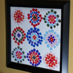
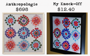
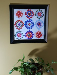
I saw this on Anthropologie’s wall decor product page, and wanted it for my mustard wall in the family room.  Then I looked at the price tag ($698) and knew I was going to have to recreate it if it were going to be on my wall.  This was so very simple you guys.  I opened up Photoshop,  used watercolor brushes to mimic the print, uploaded it to Snapfish, and picked it up at my local Miejer Store a couple of hours later!

Anthropologie Decor Knock OffI ordered a 16×20 print cause that is the biggest I can get same day for the price ($6.98).  When I am not in a hurry, I use Short Run Posters for my large format printing, cause they rock (see this post).  I could go on and on about them, but that is a different topic.  Suffice it to say, SUPER cheap, great quality large format prints.

Anthropologie Wall Decor

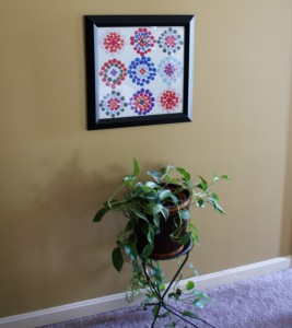
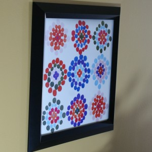
After I picked up my print, I hit my local Goodwill and found a perfect square frame for $5.  I removed the pic that was in it, cut mine to fit and that is that. It looks as awesome as I thought it would against the yellow wall, and I spent very little time and money.  Mine is 16×16 versus the Anthropologie version, which is 29×29 in, but did you see the price difference???  16×16 inches is perfect for the space.

Anthropologie Decor Knock Off

Sometimes, I really must get messy with paints and gel medium, but digital art has its perks.  Instant gratification being my favorite!  There are debates on what is right and wrong in terms of copyright, something I have been pondering lately.  Here is why I have no problem knocking off this wall art; I am not selling it.  It is for my personal enjoyment, and to hopefully inspire others to decorate beautifully for less.  More importantly, giving credit where credit is due is just the only way to make being a copycat o.k.  All art is inspired by other art, or nature (God’s art, in my opinion).  Very little is truly original  I in no way came up with this design.  It was all Paule Marrot, the artist of the original piece, and Anthropologie.  I full on copied it, adding some vibrancy, and going with a black instead of white frame.  So, what do you think?

Anthropologie Decor Knock Off

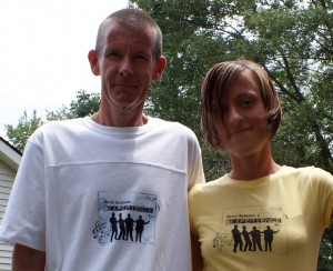
The Chris Bateson Experience; T-Shirt Transfer Project

Inkjet Tshirt Transfers

You know when a crafty blogger posts a project tutorial, but it is clear that the real purpose of the post is to drive home how talented and amazing her family happens to be?  This is one of those.  Yes, you will see how I made a custom t-shirt using HP inkjet t-shirt transfer sheets, but what I hope you walk away with is the knowledge that my stepson rocks, and so does the barbershop quartet to which he belongs.

[Read more…]

Amsterdam Printing: Custom Promotional Items Galore

I am always on the lookout for businesses that can place my designs onto products.  Recently I was introduced to AmsterdamPrinting.com and am excited to pass along this wonderful source for everything from tote bags to t-shirts to carabiners, all customized to your specifications!

There are loads of companies that offer these services, but some things stand out to me about AmsterdamPrinting.com.  They have a monster selection of promotional items, and lower pricing compared to competitors (click GOPromos promotional items).  I love the idea of handing out something besides business cards at craft shows, something people will actually use instead of just toss in the trash can.  The pens and coffee mugs are great, and I am loving the idea of personal notepads since I am always jotting down ideas.  


 I am most interested in their T-shirts, as I want to have some of the “word art” designs I incorporate into my pendants placed on shirts.  They have a wide variety of styles to choose from.  I am placing an order for a couple of samples of the shirts pictured with my designs.  I will report back once I get them!  


Free Easter Printable Round 2

The cross… the single greatest act of love in history.  Click here to download the full resolution 5×7.  Glory to God.

Free Easter Printable

This is my absolute favorite time of year… Easter.  I made this watercolor from a photo in photoshop and put it with the beautiful verse, Hebrews 11:1.  You can download the full resolution file by clicking here.  

DIY Fabulous Frugal Faux Canvas Painting Tutorial

Create an oil paint effect on prints, using Mod Podge Brushstrokes.
These prints were mounted on plywood and painted with Mod Podge to create beautiful faux oil paintings! Read on for full tutorial…

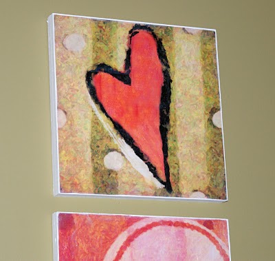
tut12I am so excited about the way this project went! As mentioned in the prior post, here, I created these prints in Photoshop with the idea in mind that I would try something similar to the project over at Infarrantly Creative (see this post).

I had the images printed at 12×12′ on glossy stock. At Michael’s, I picked up 1/2x12x12′ birch plywood squares. Since I wanted the pictures mounted on 1′ backing, I used Gorilla Glue to adhere 2 pieces of birch plywood together for each of the 3 prints. You could also use MDF in for the backing, cut to the size of your prints. I used the plywood because it was already cut to the size I wanted, and it was cheap.

Once the gorilla glue was dry, I was ready to adhere the prints to the wood. Super 77 has minimal overspray, but make sure you cover your work surface, cause this stuff is sti-iii-cky, for real. Spray a thin coat on both the back of the print and on the wood surface and lay the print in place, smoothing flat with your hand. This holds big time and bonds immediately, so make sure you have the pic lined up before placing it. I turned the piece over on a flat surface and applied pressure to the back to ensure I hadn’t missed any air bubbles. This part was really much easier than I thought it would be. I had no problem with air bubbles.

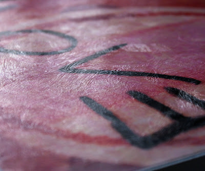
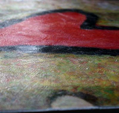
Next, the fun step using Mod Podge Brushstrokes. I just recently ran across a post using this medium and I am in love. I used a 1 inch foam bruse and small texturizing brush. I read that if you are painting the Mod Podge onto photo paper, you should use an acrylic sealer before applying. This was just glossy stock, and I had no problem with ink bleeding. You may want to test a small area before painting your entire work. I just applied strokes randomly. There wasn’t a lot of strategy. The prints themselves I made with a painted effect in photoshop, so I kinda followed along the strokes in the images, but mostly it was just random. Look how cool they are. They look like for real oil paintings!

After the Mod Podge dried for about 30 mintues, I applied gesso to the sides of the wood (you could also use primer), then painted with white acrylic over that.

I used thick tacks (U-shaped) and wire for the hanging mechanism.

 
Here they are on the wall…


You can do this with your own images, posters or garage sale finds. The Mod Podge brushstroke effect looks particularly impressive with photos that have been digitally altered using paint effects. That is a photoshop lesson for another day.

Wanna Take Better Photos? DIY Photo Cube; The best $10 I Have Spent In Ages.

I have been revamping my online shops to introduce my new pendant designs. Throughout this process, it became apparent that my macro photos of my jewelry… well, sucked. I browsed other artists stores and wondered how on earth many of them were getting such nice shots of their work. I stumbled upon a solution that seems to be working for me. All it takes (aside from your camera) is a cardboard box, some white tissue paper, some tape, a couple of cheap desk lamps, and some 100W daylight energy smart light bulbs. Here is an in depth tutorial at Strobist. This is seriously worth doing. My pictures are improved significantly, and I am not restricted by the location of the sun (or lack thereof). Here are some of the pics I have taken with my rockin’ DIY photo light cube…


Privacy Policy